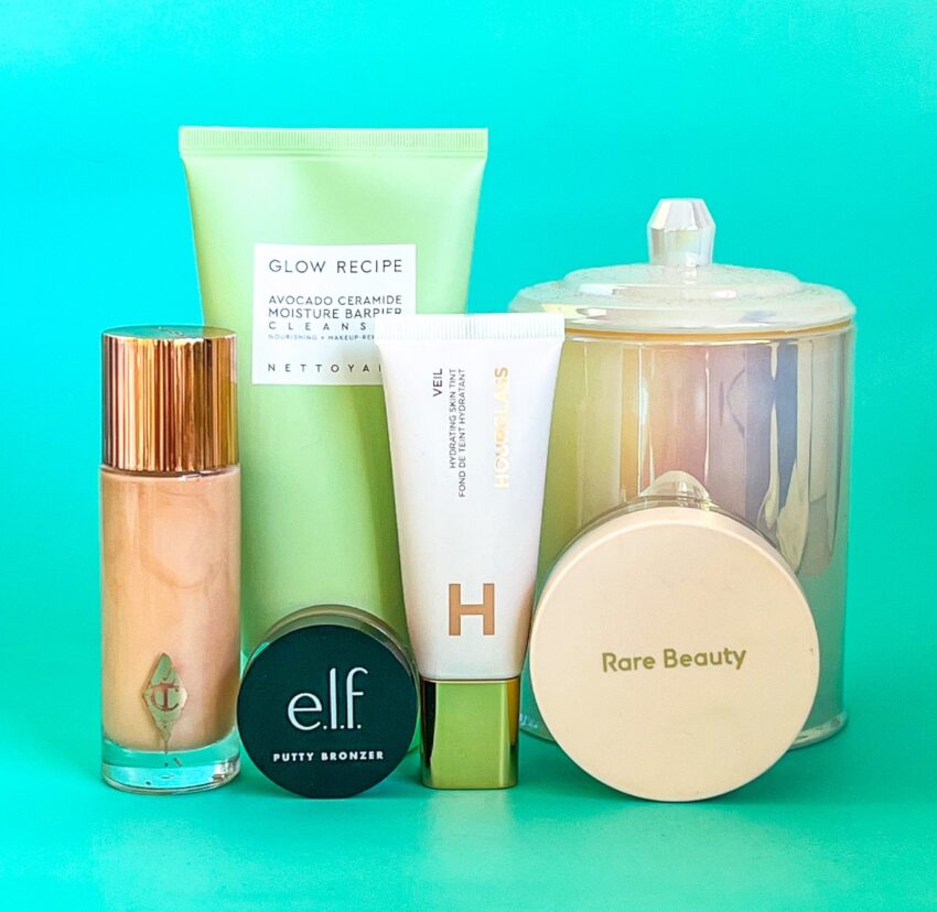
I’ve mentioned in the past that I get a lot of my post ideas from TikTok these days. Recently, I’ve seen a ton of videos from creators talking about the beauty product packaging that they cannot stand! Now, I’m a big believer in the user experience being just as important as the product itself. And I have recently come across a few products that I’ve enjoyed, but the packaging had some serious issues. Some were more aesthetic issues, and some were legit problems that made it difficult to use properly. So, that’s what I’ll be talking about today. And as always, disclaimer, I love all of these brands equally. This is just me speaking my truth.
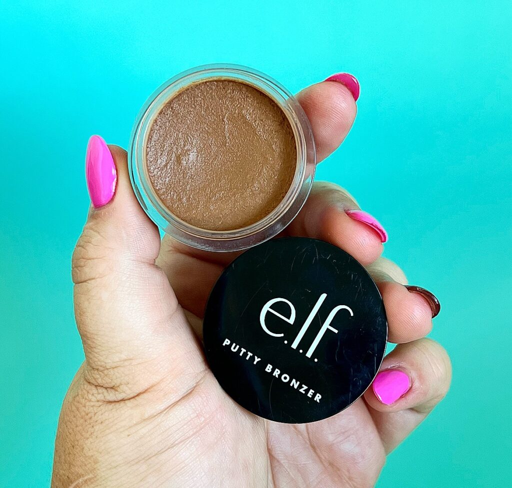
E.L.F. COSMETICS PUTTY BRONZER – $16.00
This was actually the product that inspired this post in the first place. You see, I really enjoyed this bronzer when I had it in my stash last month. I loved the finish it gave and the colour was right for me. The issue arose for me when I was trying to get even product distribution on my brush. Because the packaging of this bronzer is tiny! And it’s not like I’m using a huge bronzer brush. I’m using the Mecca Buffing Brush for my cream bronzer. But I have to really get my brush in there to get even product distribution. I get why the packaging is like this. It’s the same as the blushes. But I need this tub to be, like, double the size at least.

RARE BEAUTY ALWAYS AN OPTIMIST SOFT RADIANCE SETTING POWDER – $49.00
This one specifically got a shout out in my end of year beauty disappointments. So I won’t spend too much time talk about it. Long story short, love the sifter cover in concept, but in practice, it makes it difficult to get enough product out. And because the excess can’t go back in, it makes it very messy and wasteful to use. The sifter also blocks up easily.
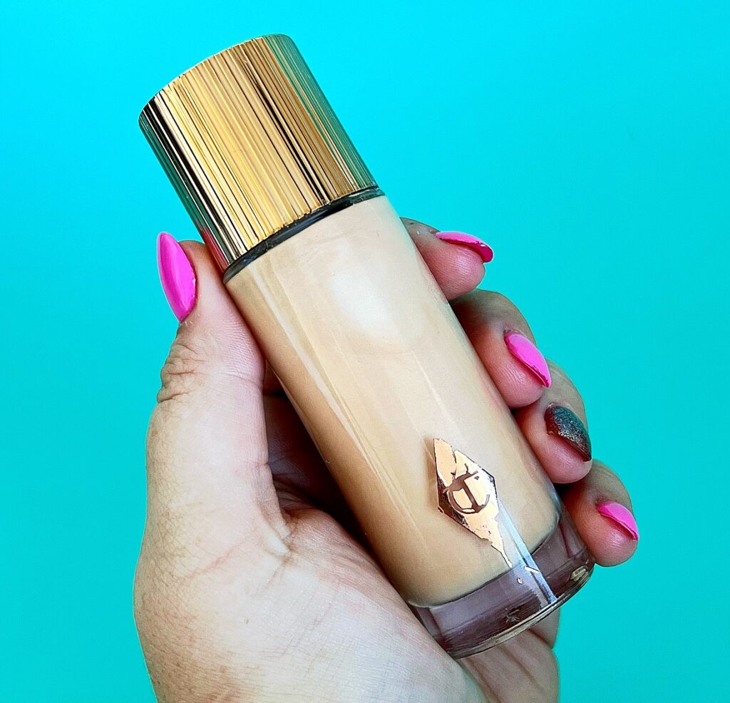
CHARLOTTE TILBURY HOLLYWOOD FLAWLESS FILTER – $70.00
Am I being petty mentioning the Hollywood Flawless Filter? Maybe. But for the love of Christ, this is $70AUD now. And the fact that the label STILL rubs off within weeks of owning it is mind boggling. Also, not sure if this is just me. But recently when I’ve used this, I’ve noticed that the cap ‘skips’ when I try to tighten it. Making me worry about how secure the product is. I do wish it was in a dropper style packaging. Mostly for the hygiene factor.
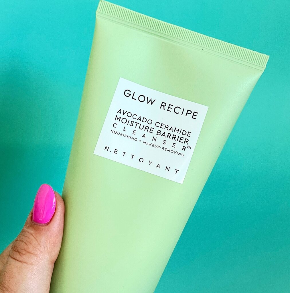
GLOW RECIPE AVOCADO CERAMIDE MOISTURE BARRIER CLEANSER – $48.00
Y’all, when I say that I love this cleanser, I mean it. This is actually my second bottle of it because I love it that much during winter. I just wish that it was in a pump style packaging. The formula is of this is kinda gloopy and on the runny side. And because the cap is on the bottom, useless I catch it quickly, I can accidentally waste product. The cleanser can also congeal under the cap, causing it to block up. Glow Recipe, I know you just changed the Body Cream from a pump to this style bottle (good call on my part), please use the pump style bottle for this!
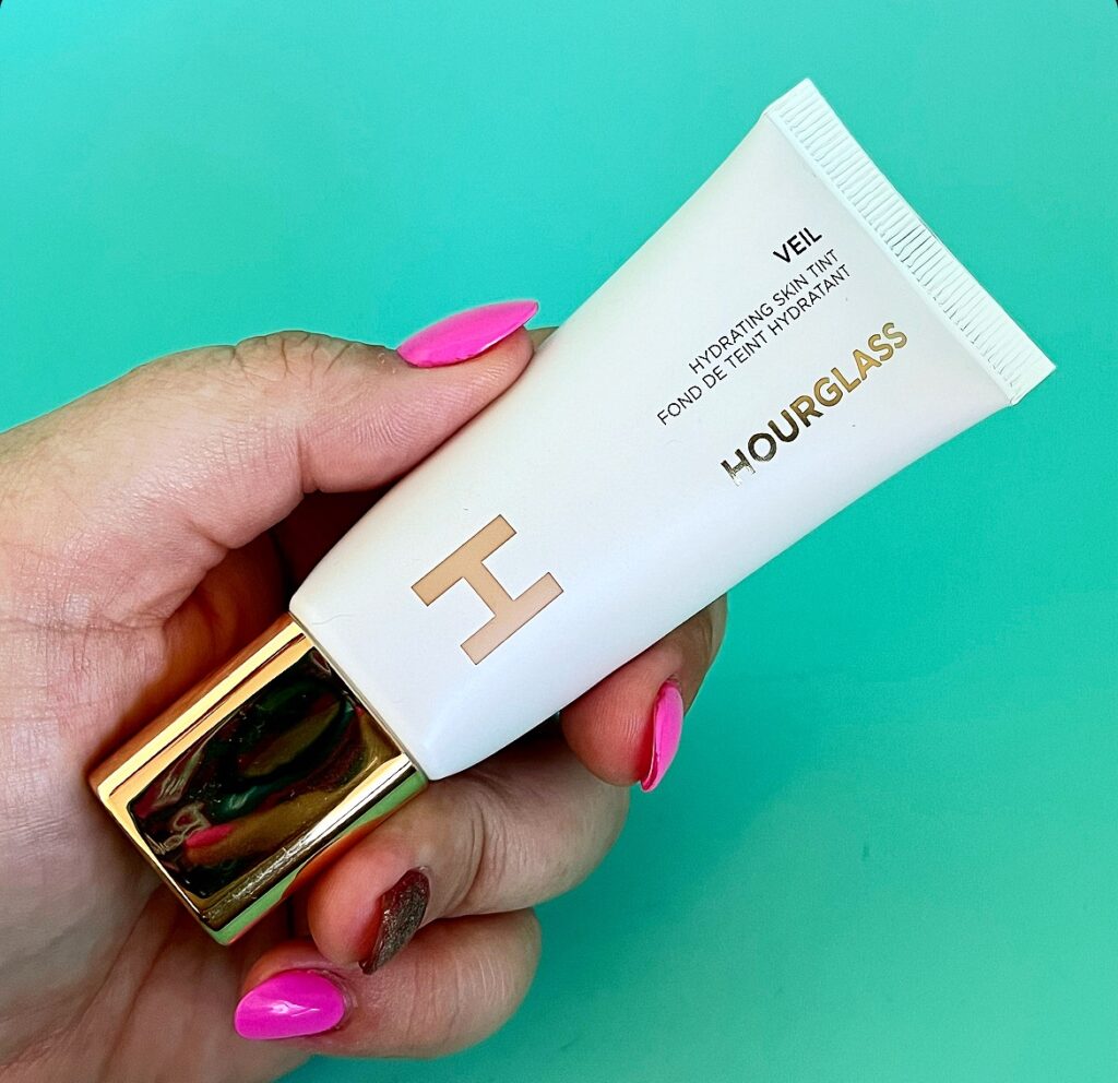
HOURGLASS VEIL HYDRATING SKIN TINT – $84.00
Finally, we have another one where the product isn’t quite right for the packaging, in my opinion. The formula of this skin tint is one of the thinner that I’ve encountered. And because the dropper is at the bottom, as soon as you take the cap off, it leaks and drips everywhere unless you hold it upside down. I’ve also had the product leak out from the cap as well. I mentioned in my review that I wish that the dispenser was at the top of the bottle. And I stand by that.
Phew, that was a good rant if I do say so myself! I would love to know what products you hate the packaging of in the comments.
Cheers and love
Emily xo
